In their recent article, “America’s summers keep getting warmer,” Axios claims that hotter summers across the U.S. are “one of the clearest ways we experience climate change.” That statement is misleading. The article focuses exclusively on “average summer temperatures” while ignoring crucial underlying details — specifically, the difference between daytime highs and nighttime lows. A closer look at the data suggests that rising nighttime temperatures — not dangerous daytime heat — are mostly to blame for the modest increase in “average” temperatures. This pattern is a well-documented signature of the urban heat island (UHI) effect, not global climate change.
The entire Axios piece rests on the idea that an increase in average temperatures over the past 50 years (from 1970 to 2024) proves human-caused climate change. But here’s the problem: an “average” can be deceptive. By combining daily high and low temperatures into one metric, the nuance disappears. And that nuance matters. According to detailed meteorological analysis done by the Environmental Protection Agency (EPA), high temperatures (daytime maximums) in the U.S. have remained relatively stable, while low temperatures (nighttime minimums) have been increasing. This skews the average upward without indicating an actual increase in daytime heat — the kind that poses the most risk to people and infrastructure. This is backed up by the National Oceanic and Atmospheric Administration (NOAA) analysis, Mapping U.S. Climate Trends, from the NOAA climate website. This report highlights that nighttime minimum temperatures have warmed at a rate of 1.43°F per century compared to 0.89°F per century for daytime maximums during the period 1895–2016, illustrating the asymmetric warming trend.


The real-world implication of this divergence is crucial. If daytime highs aren’t increasing substantially, the scare factor vanishes. Nobody complains about slightly warmer nights — in fact, many people prefer them. But when you average those warmer nights with stable daytime highs, you get the illusion of “climate change” through rising average temperatures. And that’s precisely the sleight-of-hand Axios and their source, Climate Central, are engaging in.
This divergence was comprehensively documented in recent peer-reviewed research by Dr. Roy Spencer, former NASA scientist and principal research scientist at the University of Alabama in Huntsville. In a 2024 paper published in the Journal of Applied Meteorology and Climatology, Dr. Spencer examined the spatial relationship between population density and temperature trends using NOAA data from 1895–2023. His findings? The urban heat island effect is the dominant cause of warming in U.S. temperature records, especially in the minimum temperatures that drive up averages. As population increases, more asphalt, buildings, and energy usage trap heat at night, particularly in cities. This is not global warming — it’s local heat retention caused by development. Spencer’s full paper is available here.
Now, to Axios’s credit, they do briefly acknowledge the urban heat island phenomenon, noting that “many cities suffer from ‘heat islands’ — areas of especially high temperatures caused by roads, parking lots, buildings and other heat-trapping features”. But they bury that admission and fail to connect it to the broader implication: if these “heat islands” dominate the temperature increase, then the change is local and anthropogenic in an entirely different sense — a land-use artifact, not a carbon dioxide crisis.
This is not a new argument. As we’ve outlined repeatedly at Climate Realism, the UHI effect explains much of the warming shown in localized temperature datasets. Yet climate advocacy groups like Climate Central — heavily cited in the Axios article — downplay or ignore this effect when it doesn’t serve the narrative. More fundamentally, their own data often supports the skeptical case when viewed critically. For example, they chart average temperatures but omit daily maximum temperature trends — an omission that speaks volumes.
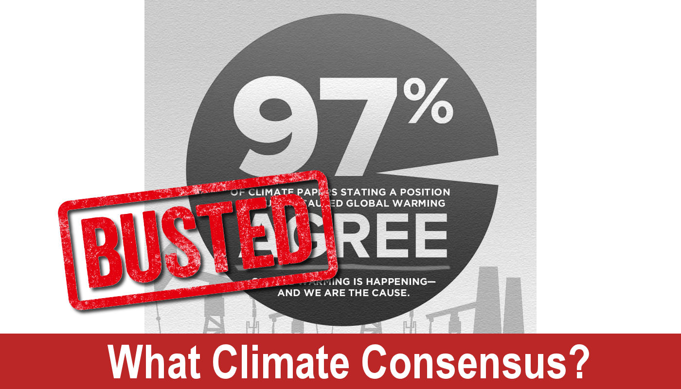
Another critical flaw in the Axios article is its lack of statistical scrutiny. The claim that 97% of cities analyzed saw warming since 1970 might sound compelling, but it’s also meaningless without examining how much of that warming occurred in rural versus urban stations. Rural stations, being less influenced by land-use change, would provide a better indicator of climate trends untainted by urbanization. But Axios doesn’t provide that breakdown — likely because it would undercut the headline.
Further, the cherry-picked focus on specific cities like Reno (+11.3°F), Boise (+6.3°F), and El Paso (+6.2°F) is another red flag. These cities have undergone dramatic urban expansion and population growth since 1970. Reno’s population has more than doubled; Boise has added tens of thousands of new homes and highways. Of course they’re warmer — they’ve built over their own thermometers. As we’ve shown at Climate at a Glance, genuine climate signals must be filtered through the noise of land use change, otherwise the data is just measuring asphalt’s heat retention effects, not atmospheric temperature increases due to the supposed heating effect of carbon dioxide.
It’s also worth noting the psychological tactics in the article. Loaded language like “health risk,” “pregnant women,” and “vulnerable groups” are peppered throughout to provoke emotion rather than provide objective data analysis. The appeal to emotion is a classic rhetorical device used to bypass rational scrutiny. Instead of showing a balanced analysis, Axios jumps straight from a graph of average temperatures to policy implications and public health warnings. That’s advocacy journalism, not science reporting.
In conclusion, the Axios piece is yet another example of lazy climate reporting masquerading as fact. It relies on average temperatures while ignoring the high/low divergence, fails to contextualize the urban heat island effect despite briefly mentioning it, and leans heavily on emotive language rather than objective data analysis. If this is the best journalism Axios can muster, one must seriously question their editorial standards and scientific literacy. They’re not informing the public — they’re selling a narrative, one misleading map at a time.


