A number of media outlets are claiming that U.S. heatwaves are getting worse this week due to climate change. This is false. Actual data from temperature measurements show that heatwaves in the U.S. are on the decline even as climate change has occurred over the last 75 years.
It is summer in the Northern Hemisphere, and unsurprisingly to those that pay attention to data, it is hot in many places in the U.S. – in other words, business as usual for summer. But, the media sees climate change in every heatwave event, and seeks to exploit a connection, even though one doesn’t exist. For example, last week it was declared that the world had seen its hottest day ever on July 4, with some outlets claiming the “hottest in 100,000 years.” That of course, was proven laughably false here at Climate Realism on both counts.
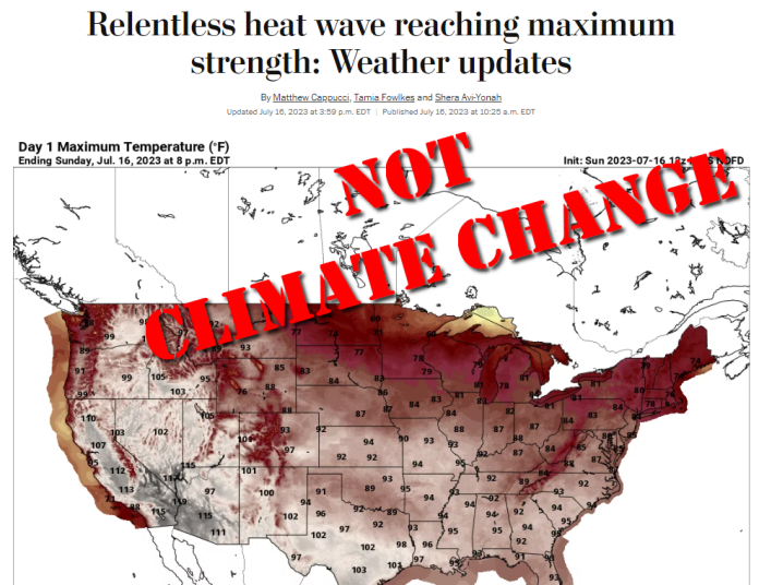
This week, the media was at it again. The Washington Post, in an article titled, “Relentless heat wave reaching maximum strength: Weather updates,” says this:
“What is a heat dome? Understand the science and how drought and climate change make them worse.”
Axios, in the article “What this summer’s weather reveals about climate change” written by the ever-excitable Andrew Freedman, opines,
Monitoring the planet’s climate this summer can give one the impression that the climate system — which includes the oceans, atmosphere, ice sheets and more — has gone off the rails.
…
Climate studies have warned about an uptick in simultaneous heat waves occurring in the Northern Hemisphere.”
Then there is the “World Socialist Web Site”, with the headline: “Record-breaking US heat wave demonstrates the growing dangers of climate change.”
None of the news outlets running heat wave stories this week examined or cites historical data on heat waves, preferring instead to push scary numbers in the form of heat indexes that combine temperature and humidity, reprint the opinion of “climate scientists,” and reference computer models that suggest climate change is making heat waves worse.
Yet, data exists, for any reporter with a modicum of journalistic curiosity to find. The problem is that the data doesn’t look scary.
The U.S. Environmental Protection Agency (EPA) maintains a web page on heatwaves in the U.S. which contains some very interesting data and maps. Despite the claims of climate change creating worse heatwaves, the data the EPA has compiled going back to 1948 says exactly the opposite.
The data is on display in Figure 1, below.
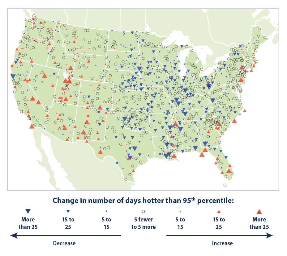
The EPA writes:
The data come from thousands of weather stations across the United States. National patterns can be determined by dividing the country into a grid and examining the data for one station in each cell of the grid. This method ensures that the results are not biased toward regions that happen to have many stations close together.
…
[Figure 1] was created by reviewing all daily maximum temperatures from 1948 to 2020 and identifying the 95th percentile temperature (a temperature that one would only expect to exceed in five days out of every 100) at each station. Next, for each year, the total number of days with maximum temperatures higher than the 95th percentile (that is, unusually hot days) was determined. The map shows how the total number of unusually hot days per year at each station has changed over time.
The EPA’s data for 1,066 weather stations across the United States showed a total of 863 stations, or 81 percent, reporting either a decrease or no change in the number of unusually hot days. By comparison, only 19 percent of all weather stations reported an increase in the number of unusually hot days since 1948.
Many of the stations showing hotter temperatures over the 1948-2020 period were located at airports or otherwise badly sited locations that created heat biases such as reported by the study Climate Realism covered last year, Corrupted Climate Stations: The U.S. Temperature Record Remains Fatally Flawed. As reported in that study, much of the upward heat bias occurs in the minimum overnight temperature at these weather stations, enabling them to reach higher than expected daytime high temperatures had they not had a “head start” from the warmer than expected overnight low.
In fact, you can see this issue on display using maximum and minimum data for all weather stations in the U.S. Figures 2A and 2B below show maximum and minimum temperatures in the U.S. from 1948, so that it matches the start of EPA data in Figure 1.
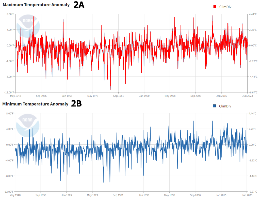
In figure 2A, you can see the maximum temperatures (the sort of temperatures that would occur in a heat wave) have not changed much since 1948. In fact, there are spikes of high temperatures in the U.S. in 1954 and in 1963 that are higher than the present day.
In figure 2B, you can see the minimum temperatures have had a slow and steady rise since 1948, with peaks in the last 20 years (warmer nights) being higher than values in the 1940s and 1950s.
Finally, another graph from the EPA shows that heat waves were actually the worst for the U.S. in the 1930s, well before climate change became a blip on the media radar. See Figure 3.
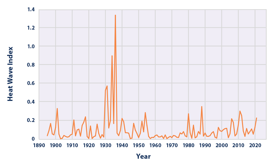
The bottom line is this: despite what the media says, real-world data shows heat waves are NOT getting worse in the United States due to climate change. This flies in the face of opinions by climate scientists cited in the mainstream media which seems wedded to the narrative that climate change is causing a crisis, despite data to the contrary.







Jul 15, 2023 Real Climate Information | Volcanos and Magnetic Pole Shift
Learn More w/the Climate Forcing Playlist.
https://youtu.be/9VXEPkqW23E
Thank you so much for fighting fear with fact. I’m an old guy now but I remember my father telling me about how hot it was in the early thirties. People would pull their beds of of their homes and try to sleep outside. No air conditioning of course and they were in the depths of the Great Depression. Later, these same people would fight and win a world war against imperialistic fascism.
And that’s why it’s correct to call them “The Greatest Generation”.
PS They lived with the weather conditions they were dealt with and didn’t whine to have their lives controlled by the church of “climate change”.
I’m still not sure who’s data is correct.
Check out this article:
https://www.epa.gov/climate-indicators/climate-change-indicators-high-and-low-temperatures#tab-4.
I got this link from your article.
This article cherry picked the data from the EPA report. The report explains the heat spikes in the 30s as a result of the dust bowl in the midwest, which was a direct result of poor agricultural practices and was easily resolved with policy changes. If anything reading the EPA article leads to a completely different conclusion than what is reported hear. As usual the cherry picking accusations from these people are really admissions of guilt.
Do you have a graph from Figure 3 that shows how the heat wave in 2023 compares to the heat wave index in the 1930s? Your graph only goes up to 2020. Also, the heat wave index takes into account humidity. Did the heat waves in the 1930s take place in high humidity areas of the US (e.g. The South) or the low humidity areas of the US (e.g. The Southwest). I’m not a meteorologist so it would be great if I could get clarification from some experts. Thanks.
Temperatures were so bad in the 30s because the U.S. was experiencing the Dust Bowl. That’s why they’re the worst recorded in U.S. history.
“Longer-term records show that heat waves in the 1930s remain the most severe in recorded U.S. history (see Figure 3). The spike in Figure 3 reflects extreme, persistent heat waves in the Great Plains region during a period known as the “Dust Bowl.” Poor land use practices and many years of intense drought contributed to these heat waves by depleting soil moisture and reducing the moderating effects of evaporation.”
It looks to me like both fig. 2A (maximum temperature anomalies) and fig. 2B (minimum temperature anomalies) both have an upward trend from around 1965 to the present. During this period atmospheric CO2 went from about 320 ppm to about 420 ppm as measured at Mauna Loa, Hawaii observatory.
You’ve left out the reason for the heat index spike in the 1930s:
“Longer-term records show that heat waves in the 1930s remain the most severe in recorded U.S. history (see Figure 3). The spike in Figure 3 reflects extreme, persistent heat waves in the Great Plains region during a period known as the “Dust Bowl.” Poor land use practices and many years of intense drought contributed to these heat waves by depleting soil moisture and reducing the moderating effects of evaporation.6”
And with respect to overall warming, the EPA says:
“Since 1901, the average surface temperature across the contiguous 48 states has risen at an average rate of 0.17°F per decade (see Figure 1). Average temperatures have risen more quickly since the late 1970s (0.32 to 0.55°F per decade since 1979). Nine of the top 10 warmest years on record for the contiguous 48 states have occurred since 1998, and 2012 and 2016 were the two warmest years on record.”