


The Washington Post (WaPo) published a story that explains how a 600 square mile chunk of iceberg has broken off from Antarctica, and that scientists do not believe it is due to climate change.
This is factually true, and WaPo should be praised for publishing a scientifically-sound article on spectacular natural phenomena without attempts trying to tie it to climate change.
WaPo writer and meteorologist Dan Stillman covered the recent drama of a large segment of iceberg breaking off from Antarctica’s Brunt Ice Shelf, in a post titled “Giant iceberg breaks off from Antarctica. Aerial view is ‘spectacular.” Stillman reports that the calving occurred “during a particularly high tide known as a spring tide,” and has been expected by Antarctic researchers for years now after a large crack formed and expanded.
The article goes into detail about the theory and mechanics of the ice shelf and the natural growth of the chasm that eventually caused a split—in part due to the growth of the ice shelf itself.
Stillman wrote, “Unlike some previous icebergs and collapsed ice shelves that have been linked to climate change, the BAS press release said the break is a “natural process” and there is “no evidence that climate change has played a significant role.”
This is the only time in the article that Stillman attempts to attribute Antarctic ice calving in general to climate change. To Stillman’s credit, it is far more reasonable compared to the blind hysteria surrounding an earlier ice calving in spring 2022, in which a smaller section of an eastern Antarctic ice shelf broke up, and media headlines falsely claimed that it was the “first time in human history” that such an ice shelf collapsed. When those stories ran, Climate Realism pointed out, here, that this was only the first time a satellite observed an ice shelf collapse in east Antarctica.
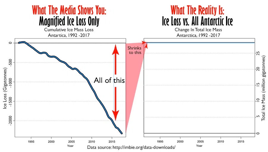
There is very little to be worried about when it comes to Antarctic ice melt. Collected data from Climate at a Glance: Antarctic Sea Ice Melt shows that recent ice loss in Antarctica is barely a drop in the bucket compared to the total volume of ice on the continent, nor are losses causing any significant or alarming acceleration in sea level rise.
The figure below illustrates how a seemingly impressive amount of ice loss barely makes a dent, compared to all of the ice existing on the Antarctic continent.
Later in the article, the WaPo journalist quoted senior researcher at the University of Colorado at Boulder, Ted Scambos, reiterating that this calving event is “just a part of how Antarctica’s ice sheet works,” and that it usually has “nothing to do” with any climate change related forcings.
Praise is in order for the scientists and journalists like Dan Stillman who refrained from attempting to rope this natural event into the climate alarm narrative, which all too often overshadows good science.


I am not a fan of graphs with truncated axes because they too easily mislead.
The graph at the left above is particularly offensive because it provides no information regarding the total ice mass or the percentage loss. The graph at the right above provides essential perspective. Most readers would not know the magnitude of the Antarctic ice mass.
The graphs of change in the global temperature anomaly, while also suffering from truncated axes, at least refer to a commonly recognized measure which provides some perspective. However, they don’t provide the perspective of graphs such as the graph below, which compares the change in global average near-surface temperature with the total range of historical maximum and minimum temperatures in a Mid-American city and the typical range of daily temperatures in January and July in that city:
https://www.therightinsight.org/media/uploads/images/climate141-4%20Wichita%20Average%20Annual%20Global.jpg
I disagree with Mr. Reid
The two Antarctica charts in the article are the best Antarctica charts I have seen in 25 years of climate science reading. They immediately show the difference between an honest chart and a dishonest chart. I used to have a blog called The Honest Climate Chart blog, which featured those charts about 5 years ago:
http://elonionbloggle.blogspot.com/
I also disagree with the chart at the link Mr. Reid provided. The red bar and blue bar on “his” chart are not explained and could be confusing for many people. The average temperature line is okay. But remember that not one person lives in the average temperature. So the statistic is not relevant for local climate changes where people live and work.
A MUCH better chart, that includes the global average temperature and CO2 levels, is at my new climate science blog:
https://honestclimatescience.blogspot.com/2023/01/nasa-giss-global-average-absolute.html
Due to this disagreement, I must challenge Mr. Reid to a duel. It is possible that I am wrong, but that is nowhere near the top of my list of possibilities.
However, I still Mr, Reid’s articles at:
https://www.therightinsight.org/
My comment saying I disagreed with you was deleted or censored.
Free speech is not the rule here. … I favor the dual Antarctica chart in the article and believe it is the best Antarctica chart I have seen in 25 years of climate science reading. I published it on my climate science blog about 5 years ago.
I have no problem with the dual chart, only with the left pane as a single.
This article is on my daily list of the best climate and energy articles I read today:
https://honestclimatescience.blogspot.com/
Also, I assume what broke of was sea ice, if so then it will not effect sea levels as it was already in the sea.